TidyTuesday
Dubois Challenge
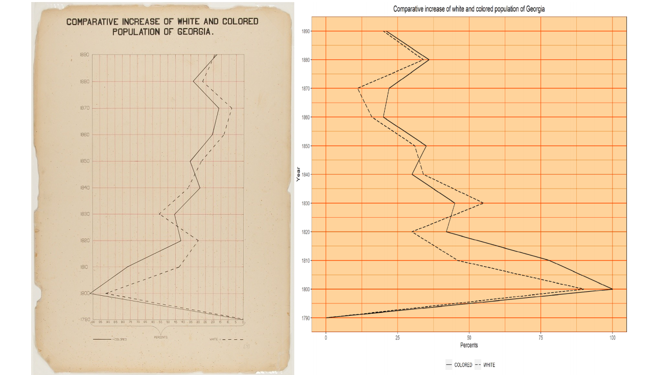
challenge 01: Comparative Increase of White and Colored Population in Georgia
The Dubois challenge was all about recreating plots created in the 1800’s by W.E.B Dubois. In the 1800’s Dubois made the original illustrations by hand, the Dubois challenge was aimed at recreating the same graphs using R (or any other modern data visualisation tool).
For task 1, I recreate a graph Dubois comparing the increase in population of whites versus the “coloured” people in 1900’s Georgia, down to trying to recreate the sepia color of the original probably caused by aging
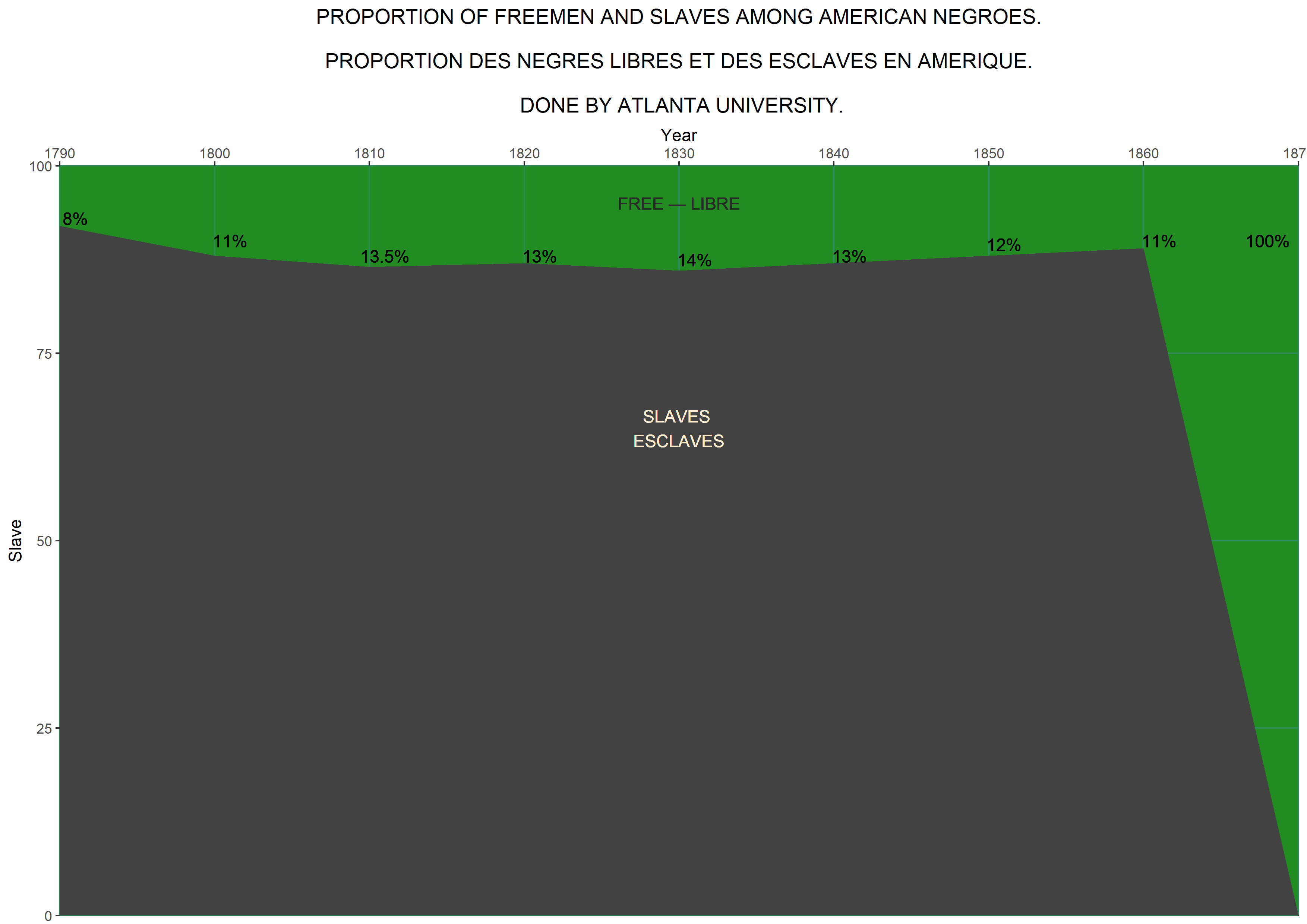
challenge 04: Proportion of Freeman and Slaves Among American Negroes
Another recreation of W.E.B Dubois’s data visualisations, the original illustration was created with the help of students at Atlanta University where he was a Professor of Economics and History. Dubois used his had drawn visualisations to show the oppression of black people in the US (see the TidyTuesday repository for original figures).The steep drop off at 1860 coincides with seismic shifts in the US at that time, the American civil war breaking out in 1861, and certain politicians putting pressure on President Lincoln to emancipate the slaves, and later on the Emancipation proclamation issued on January 1 1863. The Emancipation Proclamation meant that slaves who managed to escape their masters became ‘legally free’. ref: Wikipedia-Slavery in the US
I thought the use of stark black in his original plot was striking because it does make the image grim, very much like the subjects he dealt with.